


September 06, 2004
"Updating" a Brand
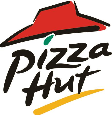
I've commented recently to Brian that I don't like Pizza Hut's updated logo. I think it was changed sometime in the last three years or so - the kinda scribbly print when it used to be block letters with a horizontally levelled "hut." That logo promised stability and memories for me, but I guess today's brandmeisters felt it was out of date.
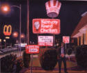
KFC did it, too - when the name officially changed to KFC from Kentucky Fried Chicken in 1991. As if a big old Colonel (the hardest word on EARTH to spell as a child) would carry the brand. And that Colonel was everywhere.
I can't think of anything else offhand, but I know a lot of brands get updates. And for some reason this was on my mind today.
hln
Comments are disabled.
Post is locked.

|
 |
I can't think of anything else offhand, but I know a lot of brands get updates. And for some reason this was on my mind today.
|

|
Posted by: hln at
07:52 PM
| Comments (4)
| Add Comment
Post contains 138 words, total size 1 kb.
1
The also did away with their red-topped buildings. Which is odd in a way, since it is still part of their logo.
http://www.findarticles.com/p/articles/mi_m3190/is_3_37/ai_96826352
Hard to imagine what these folks were thinking.
Posted by: PromoGuy at September 07, 2004 12:46 PM (OyLaU)
2
And how many hundreds of millions did USPS pay to change their eagle logo from a real one to a stylized one?
Posted by: Aaron at September 08, 2004 08:06 PM (aEZts)
3
Do you remember the old style of Taco Bell buildings? The ones that actually had a bell-like structure in front of them?
Ah, memories...
Posted by: david at September 09, 2004 10:11 PM (1+76a)
4
pizza hut sucks tho .. that stuff is killing america slowly. no wonder 50% are overweight with 30% of that being obese individuals!
Posted by: express at October 25, 2004 01:50 AM (74r+D)
16kb generated in CPU 0.0159, elapsed 0.1006 seconds.
83 queries taking 0.0918 seconds, 200 records returned.
Powered by Minx 1.1.6c-pink.
83 queries taking 0.0918 seconds, 200 records returned.
Powered by Minx 1.1.6c-pink.

